Rockbuster-SQL-Project
Projects
Rockbuster Data Analysis Case Study
The following project is an assignment from CareerFoundry’s Data Analytics course. I completed the project independently; however, in this case study I refer to an analyst team and speak in first-person plural. See the full GitHub repository here.

Overview and Purpose
Rockbuster, a movie rental company, is interested in launching an online video rental service. They’ve asked our team to conduct ad-hoc analysis to answer business-related questions.
Context
Rockbuster’s dataset was ready for a relational database management system. They needed someone’s SQL skills to answer their questions.
See the data dictionary here.
Download a .tar of Rockbuster’s database here.
Objective
Rockbuster wanted to know:
• Top countries by customer count
• Top cities by customer count within those countries
• Top five customers by total amount paid within those cities
• Total amount paid by country
We then did further analysis, discovering:
• Nearly all active cities have just one customer
• By country, there is a strong correlation between number of customers and total amount paid
Tools and Skills

PostgreSQL: SQL SELECT Querying
• Aggregate functions and GROUP BY • Filtering with WHERE and HAVING
• Multiple table JOINs
• Subqueries
• Common Table Expressions using WITH
• Exporting query results to .csv files

Tableau: Visualization of Results
• Point Map
• Scatterplot
• Histogram
• Storyboard for presentation
Project Steps
First, we uploaded the dataset to PostgreSQL and generated an entity relationship diagram (ERD), which is shown below. We chose PostgreSQL because the nature of Rockbuster’s questions lent themselves to SQL querying: The questions dealt with subsets of the data, and SQL makes it easy to pull specific portions from datasets. The ERD is necessary for the analysis because it shows how the data tables are connected to one another. We needed an understanding of those relationships to combine the tables while querying the data. There were no difficulties with this stage of the project, as the data was ready to be uploaded into a relational database management system, and PostgreSQL has a built-in ERD generator.
Next, we queried the data to answer business questions. This was the most involved step of the project, requiring SQL expertise. Our goal was to come up with result tables that could be exported for visualization.
The select queries required aggregate functions, multiple joins as well as group by, order by, having, and limit clauses. We also used common table expressions and subqueries. We were able to save time by taking advantage of the way many of the questions built on one another; we copied previous queries and tweaked them to create common table expressions.
A challenge we faced is that more than nine cities—in the top ten countries by customer count—were tied for second in terms of customer count, and Rockbuster wanted the top ten. Moreover, they were tied at a value of one, so any active city was truly in second place. SQL generated ten results, seemingly arbitrarily. In fact, cities 2-9 changed when using a subquery instead of common table expression. To navigate the multiple-second-place-cities dilemma, we included a histogram of customer counts in our final analysis after displaying on a point map the top 10 that SQL generated.
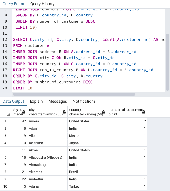
In hindsight, it would have been better to include all the active cities in the table for our point map. This would have drawn more attention to the many-way tie. Additionally (breaking the fourth wall in this sentence), had this been a true analysis, we would have contacted the data engineer or client to see if the data they sent us was incomplete/corrupted. After each successful query, we exported the resulting data to .csv, which is easily read by Tableau.
Download an Excel file showing all of the SQL queries and results here. To see the queries individually, see the SQL query folder here.
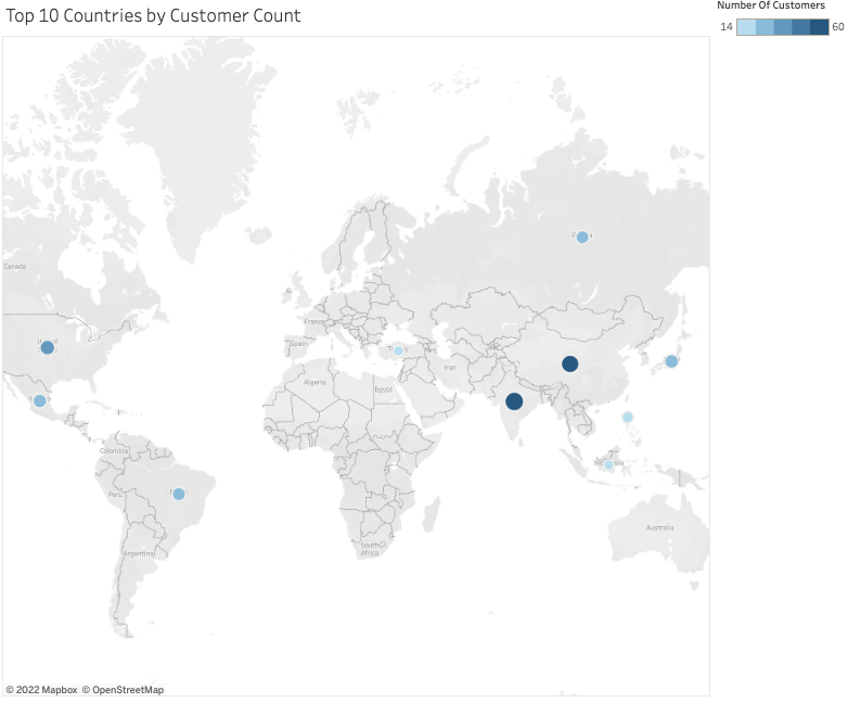
In Tableau, made a story board to present our findings to Rockbuster. We started with an executive summary, then answer the questions the company posed, and finally display some of our own analysis. We chose this order to first set the stage and share key results, then show what Rockbuster requested, and finally elucidate with more visualizations. We created point maps to visualize the information Rockbuster requested:
• Top countries by customer count
• Top cities by customer count within those countries
• Top five customers by total amount paid within those cities
• Total amount paid by country
We chose to use point maps for easy geospatial trend spotting. We used size and color to denote the magnitude of the values.
Our additions to the analysis were a scatterplot, which showed the correlation between a country’s customer count and revenue, and a histogram of the customer count by city. A correlation between customers and revenue is often assumed, but we were able to confirm that assumption with the scatterplot; its trendline had a correlation coefficient very close to 1—a near-perfect correlation. The histogram illustrated the lack of customer depth in active cities, as almost every city had just one customer.
There were no setbacks during the storyboard process, as the visualizations were straightforward.
View our full storyboard here
Conclusion
I switch to first-person singular in this section, as it contains reflection. I also reacknowledge that this was an educational project.
I was able to answer all the questions Rockbuster asked. The most surprising finding was how many cities had just one customer. If this were not an educational project, I would have reached out to a higher-up or the client before delivering the final product–to find out whether the lack of customers per city is an error. I did speak with my course mentor about this, mentioning that it may have been a measure to reduce the total amount of data in the dataset. He confirmed this suspicion.
If I were to change anything, I would have included all the active cities in my point map of the top cities by customer count within the top ten countries, as I mentioned in the previous section.